Moodboards.
After an extended round of visual research, rooted in the brand strategy (positioning, pillars, audience and tone of voice), three distinct moodboards were developed for Camila Duarte.
Each direction is a coherent world of its own — a hypothesis on how the brand could look, sound and feel. They are not meant to be combined: they are three honest, divergent starting points. The one that resonates becomes the spine for the next chapter, the Brand Style Guide.
Roots.
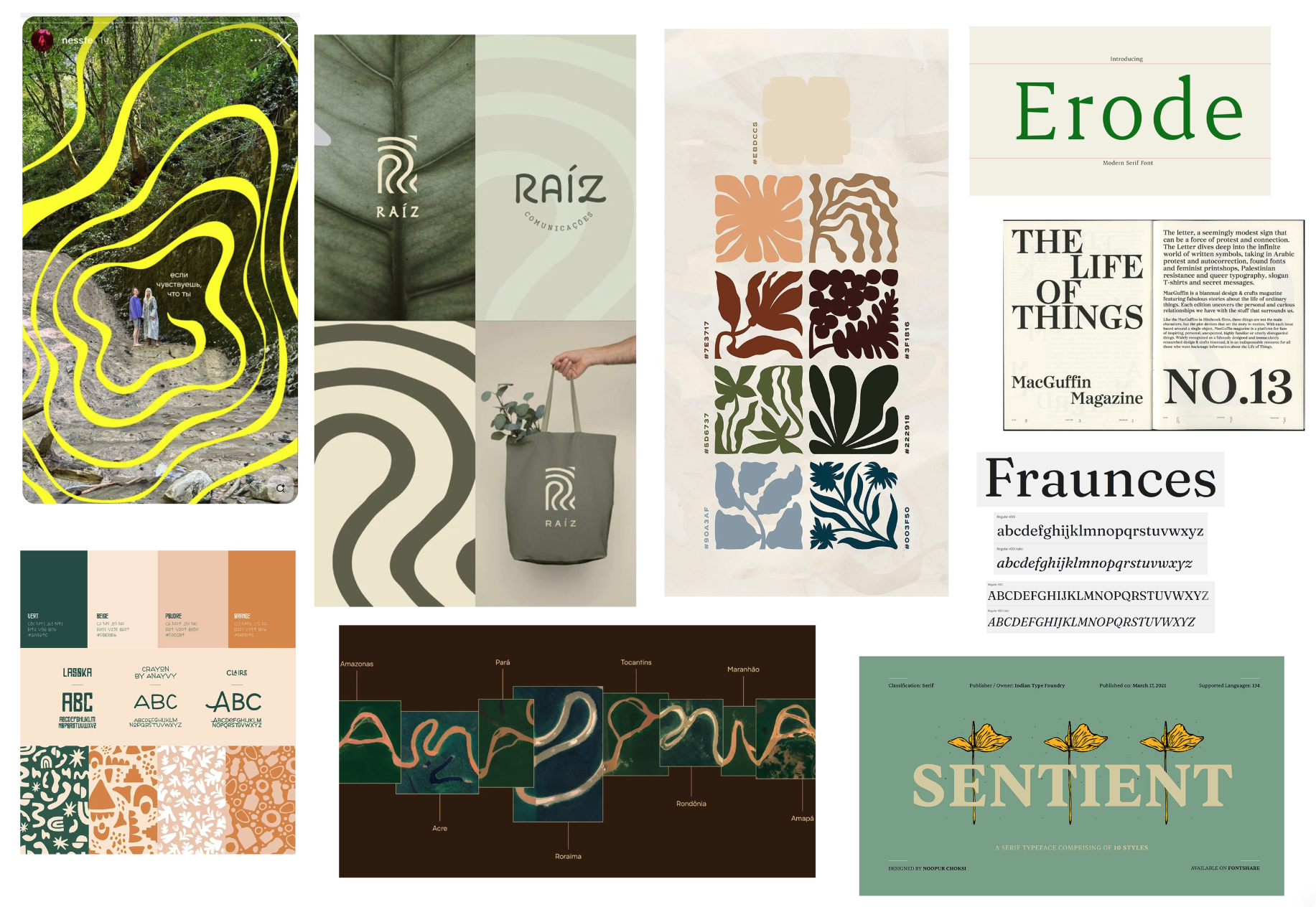
Nature shows up as roots, soil and stone — a warm, grounded, documentary world.
In this direction we explore a strong connection to nature, but very different from how the green category does it. Here nature is roots, soil and stone, not bright green or leaf icons. The Brazilian heritage comes through too, but as perspective and texture, not as label or theme.
The visual vocabulary works on surrealist organic forms (Matisse, Tarsila, Dalí), with an earthy warm palette built on terracotta, deep forest green, ochre and a quiet dusty blue, never reading as sustainability green. Typography pairs an editorial serif with character for headlines with a clean humanist sans for body. Photography is documentary and textural: weathered stone, iron-ore tones, landscape over portrait.
The Byline.
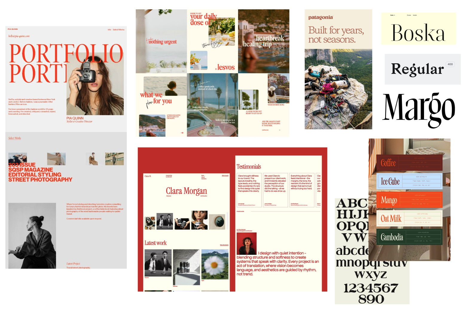
The practice is editing, not branding — a newsroom voice, candid and behind the scenes.
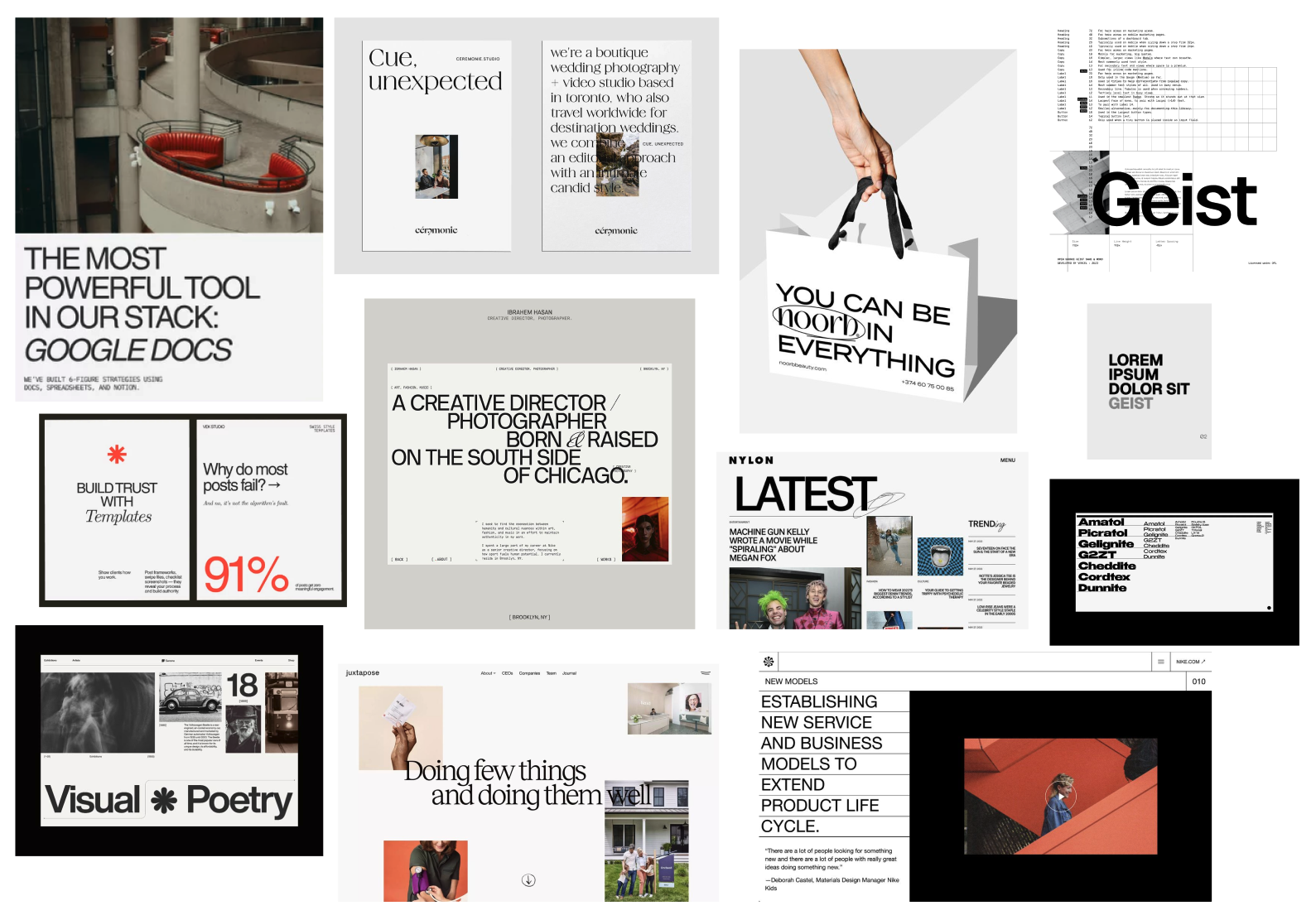
In this direction we lean into the editorial side of the work, the idea that the practice is editing, not branding. The reference is a newsroom: a peer at the table, redlining the deck, working behind the scenes.
Cream and deep ink as base, one editorial vermillion red used only as accent, generous whitespace, an editorial serif paired with a humanist sans. Photography is candid and almost stolen — real work moments rather than staged portraits, in the territory of a well-designed independent magazine.
The Mark.
Lots of white space carries one decisive accent — typographic, modern and confident.
In this direction we go minimal and modern: lots of white space, oversized typographic statements, almost no photography. The personality lives entirely in one decisive accent that does all the emotional work.
Two options on the table: a vermillion redline reading as editorial mark of quality, or a fluo greenlight reading as the operational "go" signal — the green that says go, not the green that says eco. Typography is a bold caps grotesque for headlines with a monospace companion for brackets, datelines and small structural details. Clean structure plus one strong mark, legibility and decision over decoration.